Simplifying the Temporary Restraining Order Application
AnnieCannons | EasyTRO
CONTEXT
The Challenge
Non profit AnnieCannons works with survivors of domestic violence by teaching them to write code and develop software as a means to financial independence. Unfortunately, survivors have repeatedly expressed the challenges in applying for a Temporary Restraining Order (TRO), which is a necessary step to attaining safety.
My Role
Over a period of 2 months, our team designed a mobile app that simplifies the form-filling process and offers emotional support and services along the way. My focus was onboarding design, form design and branding.
Preview of Key Screens
Results
After multiple usability tests and iterations, we landed on a design that users found comforting, comprehensible and easy to navigate. AnnieCannons will be launching EasyTRO in Q2 2019.
USER RESEARCH
Empathizing with Survivors
To understand the challenges involved in the application process, we spoke with survivors who had successfully applied for a Temporary Restraining Order. Because of the sensitive nature of their experiences, our research team was all female:
They specifically wanted to understand:
Which parts the form were most overwhelming?
Which parts of the process were most emotionally taxing?
Which parts of the process - both before and after completing the form were most confusing?
Considering our 8-week timeline, we decided to focus our attention on solving the following three pain points:
COMPARATIVE ANALYSIS
Assessing Solutions
To understand how other products addressed these pain points, we ran a comparative analysis. We assessed products in each of the following categories: form-filling, informational, and mission-driven.
IDEATE
Reorganizing Questions
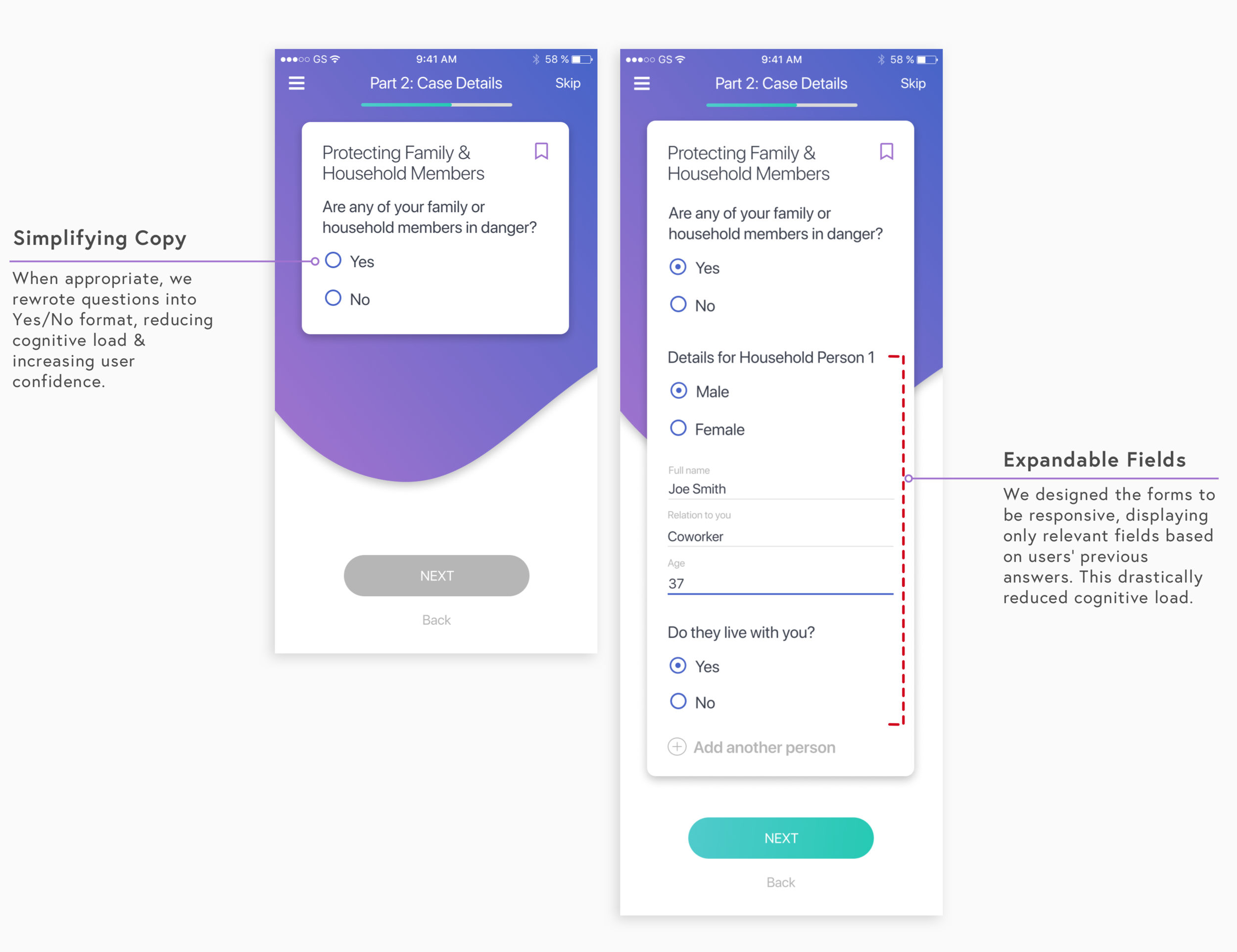
We started by cutting up the form and reorganizing questions to reduce the time and emotional strain endured by the user. We paid close attention to the way questions referenced each other, designing for progressive disclosure and autofill of future questions, allowing us to decrease total inputs from 163 to 76.
I suggested we borrow techniques from counseling psychology and start with general information-gathering questions to create a level of comfort and confidence before moving into the more emotionally challenging questions.
Revising Question Copy
The terminology used on the DV100 is technical and confusing, making vulnerable survivors feel inadequate. We identified voice and tone guidelines which we kept in front of us as we redrafted the questions. To ensure we remained within the legal scope of the form, we worked with a former DA and a lawyer as we redrafted the questions.
Design Studio
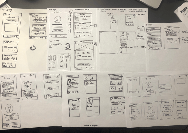
We started our UI process by sketching as many options as possible and dot voting on favorite features.
BRANDING
Designing for Calm
We ran a series of branding sessions with the founders to define brand words and attributes for the app. We explored a collection of serifs and sans serif fonts due to their readability, ultimately deciding on the SF typeface.
UI DESIGN AND TESTING
Testing and Iterating
Once brand colors, typography, voice/tone guidelines and the feature set were finalized, we moved directly into high-fidelity designs as task flows were simple and most of our focus was on creating a calming and comprehensible experience through colors and question copy.
Creating Clarity for Survivors
Every survivor we interviewed declared lack of transparency around the application process as one of the greatest pain points. To begin ideating we sketched a series of ideas, including: a set of screener questions, a swipe guide and an onboarding flow requiring login credentials.
We decided it was important to have a visual reference of the process complete with resources for survivors to refer back to anytime they felt confused.
FINAL DESIGN AND IMPLEMENTATION
Animations
Animations were a way for us to provide clarity without introducing significant friction. We designed two simple animations which clearly explained the role EasyTRO plays in the application process.
The Onboarding Animation appears once the user has entered the app, but before they have started the form.
The TRO Assembly Kit Animation is displayed at the end of the form, illustrating that the user’s forms will be compiled and sent.
Form Design
Our goals for form design were primarily around ensuring ease of navigation, decreased completion time and clear comprehension.
Main Navigation & Progress Indicators
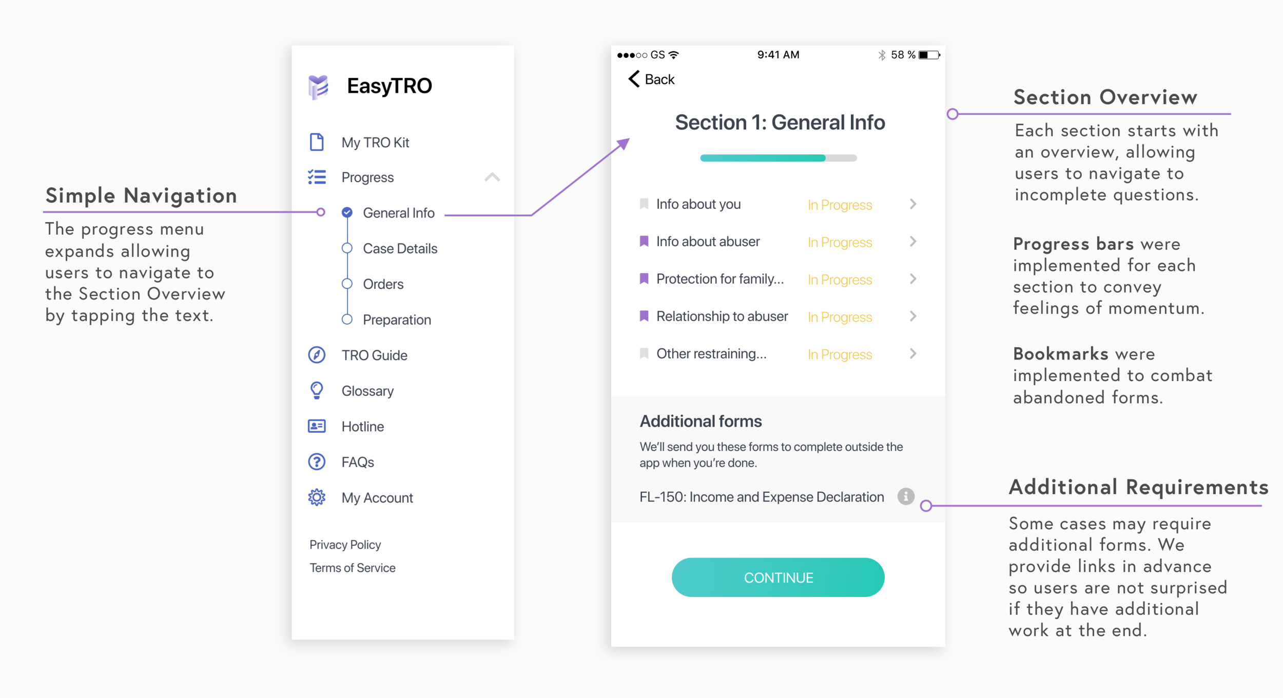
A persistent challenge was working with survivors’ emotions and providing encouragement along the way. We started with a single progress bar for the entire form, however, due to the length of the form and the fact that some questions were more emotionally challenging and required more time than others, the single progress bar failed to encourage users.
We explored a range of solutions and decided to separate the form into four sections and use a progress bar for each section. Furthermore, we incorporated a general progress indicator with tappable check marks in the main navigation to display overall progress and allow for easy navigation to each section.
To further address the issue of abandoned forms, we implemented a bookmarking feature, allowing users to return to questions that required evidence or additional thought.
TESTING
Validating our Decisions
Throughout our process, we ran validation tests and executed design iterations frequently. We were unable to test with survivors, due to the sensitive nature of recounting their abuse, so we ran usability tests with women who fit the user persona. AnnieCannons will be testing and recording completion time of the final product in Q3 2019.
REFLECTION
Final Thoughts
Solving a challenge this sensitive was both difficult and rewarding. We needed to overcome a number of constraints in testing and research, which required us to flex our creative muscles to ensure we were collecting insights relevant to our end user.
Working on a mission-driven product was particularly motivating and drawing from techniques in counseling psychology offered a unique opportunity to utilize knowledge I had from prior experience. From developing the brand to reimagining an antiquated experience into a modern and seamless user experience the design process was both rewarding and engaging.
EasyTRO will be piloted in Alameda County and the Greater Bay Area with plans to expand across California.


